An article on thin line display issues when PDFs are viewed in Acrobat
Do your PDF Line weights look wrong in Acrobat?
A simple solution to Acrobat’s ‘enhance thin lines’ feature.
Adobe Acrobat will sometimes add visible thickness to lines that fall into the category of requiring ‘enhancement’. This feature was added to Acrobat viewer during a time when low resolution CRT screens were in use, and as such the ‘enhance thin lines’ feature was there to help narrow lines stand out in PDF documents. If your PDF Line weights look wrong when opened in Acrobat, it could be related to this issue.
Most designers today, however, need line thickness to display faithfully in the exported PDF, exactly as it does in Illustrator. Read on to solve this issue quickly, with no need to ask clients to change the default ‘enhance thin lines’ setting in Acrobat.
Scenario
You have created a layout in Illustrator and converted all of your fonts to outlines. The layout looks fine in Illustrator. You then export a PDF and open it in Acrobat, and every occurrence of the letter “I” in the layout is too thick – your PDF line weights look wrong.

This is down to how Acrobat is displaying your PDF. The PDF export itself is fine. The setting ‘enhance thin lines’ in Acrobat viewer itself is the culprit (please see image below). However, it is not realistic to ask every client to go into the Acrobat settings and switch it off. Also, there is no option to switch this feature off when we author our PDF. Therefore another solution is needed.

The solution
The solution is to add points to the affected shapes. I came to this conclusion when I realised that only shapes with 4 points are affected i.e. a rectangle (however long or short). When points are added to that rectangle, the shape renders as expected. Please see the third row in the image below that shows the applied ‘fix’.

Simply by adding points to the ‘I’ shapes as follows, Acrobat no longer treats it as a ‘thin line’ and therefore escapes the ‘enhance thin lines’ feature in Acrobat.

If you have a lot of shapes affected by this issue, you do not have to manually add points. It can be done by selecting the affected shapes, and using ‘object / path / add anchor points’ as follows. This will automatically add anchor points to the shape for you.

I hope this articles helps. Having researched the issue in online forums, I read that some designers feel that fonts should not be outlined when exporting a print-ready PDF (and as a result this issue would not occur). However, in a real world every day scenario, I am asked by printers 100% of the time to provide print-ready PDFs with outlines only (i.e. no embedded fonts allowed).
And although the PDF would ultimately print just fine regardless of the ‘enhance thin lines’ feature, clients wish to see that the line weights are correct in their digital proofs as well as in print, and this solves that issue.
Please share this article using the buttons below, so that others may be aware of this solution.
 Blue Hotel IllustrationOctober 24, 2020I haven’t posted in a long time. I set up this blog with the intention of updating it regularly, however it has not worked out that way, mainly due to other
 Illustration (Urban Theme)July 28, 2018Spirit of the Staircase (2D illustration) This is a section of a larger illustration I am working on. It is part of a series of 2D vector illustrations which I hope
 Install Sass on macOSAugust 28, 2017This is a simple short guide on how to install Sass on your Mac. If you receive an error whilst installing Sass, this article should provide a quick and simple solution. At the time of writing I am using macOS Sierra 10.12.5.
 How to install WordPress Locally (Windows PC)July 27, 2017The following guide will take you through the full process of setting up the server, creating a database and installing Wordpress on your local computer. I create
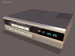 Game prop – 80s VCROctober 28, 2016Bob’s video recorder This is another prop I created for iOS game ‘The System‘ starring Bob Logan, out now on the Apple App Store. Bob is a

